Quiet zen rock garden with carefully raked sand
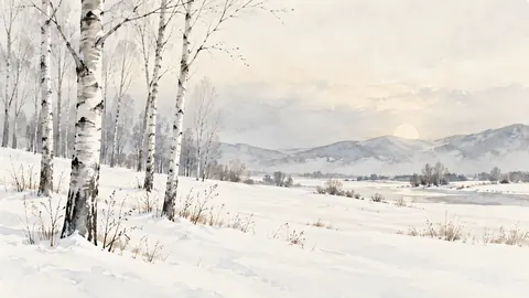
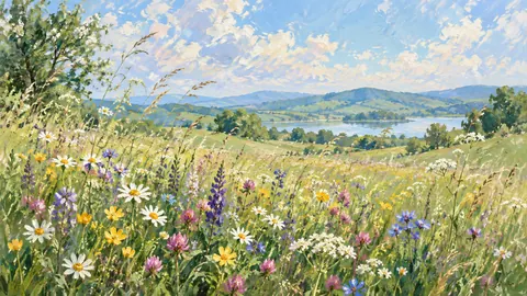
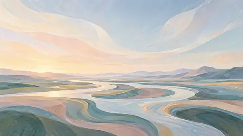
Soft pastel landscape
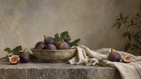
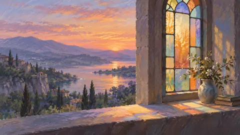
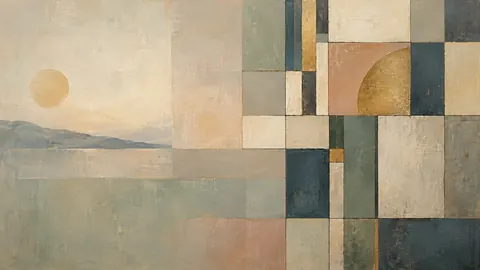
Pastel is the gentlest medium on a screen: velvety grainy strokes, edges blended by hand, colour that sits dusty and low. The Frame's matte panel and a brightness setting two or three notches down make these look like paper on the wall rather than a picture of paper.
The set runs from still life and quiet architecture to soft coast and meadow light, plus a few muted pastel abstractions – the right choice for a bedroom, a bright room, or anywhere the TV should recede rather than announce itself.
113 designs · 3840 × 2160 JPEG · included in the 1,267-design bundle
Soft pastel landscape

Soft pastel landscape

Soft pastel landscape
Soft pastel landscape
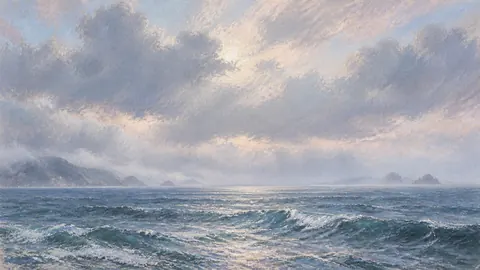
Soft pastel landscape

Soft pastel landscape

Loose pastel drawing
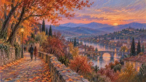
Loose pastel drawing
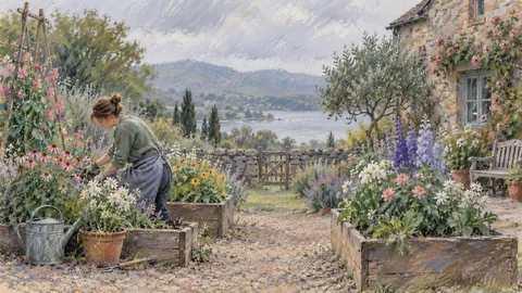
Loose pastel drawing

Loose pastel drawing
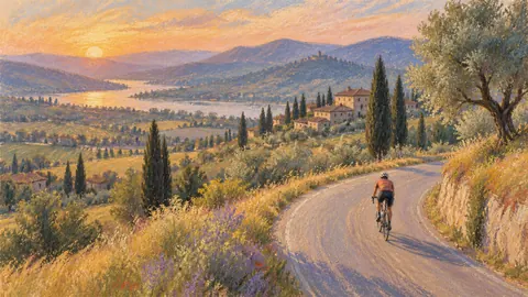
Loose pastel drawing
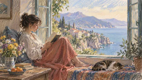
Loose pastel drawing

Loose pastel drawing
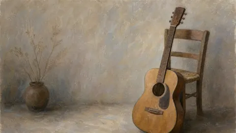
Loose pastel drawing

Loose pastel drawing
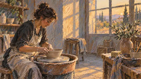
Loose pastel drawing
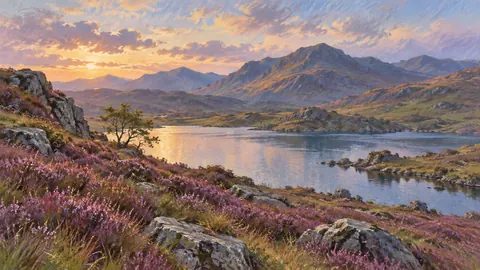
Soft pastel drawing
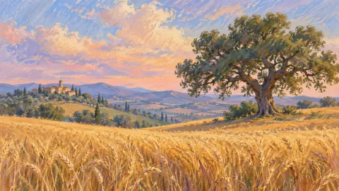
Soft pastel drawing

Soft pastel drawing
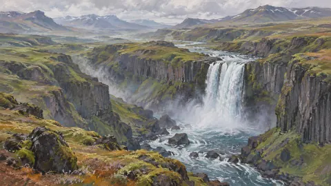
Soft pastel drawing

Soft pastel drawing
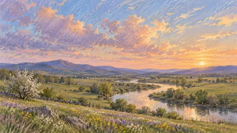
Soft pastel drawing
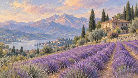
Soft pastel drawing

Soft pastel drawing

Soft pastel drawing

Soft pastel drawing
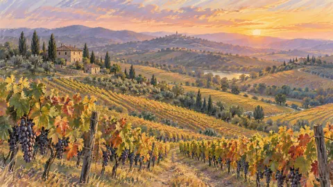
Soft pastel drawing
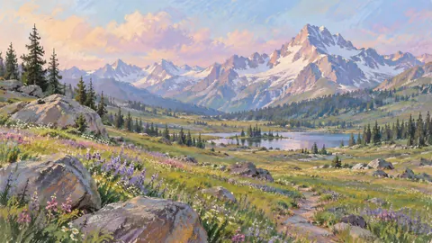
Soft pastel drawing
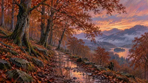
Soft pastel drawing

Soft pastel drawing
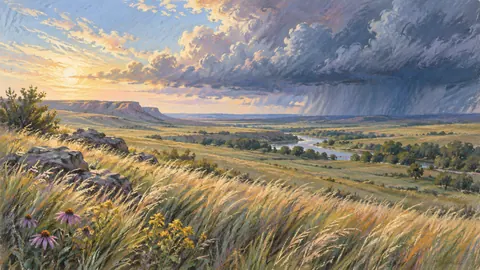
Soft pastel drawing
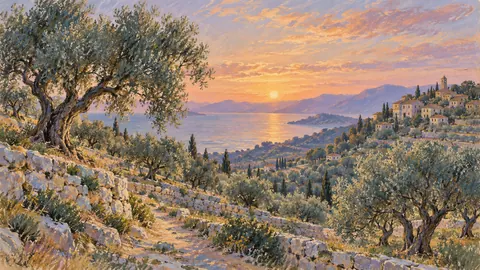
Soft pastel drawing
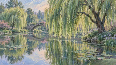
Soft pastel drawing

Soft pastel drawing
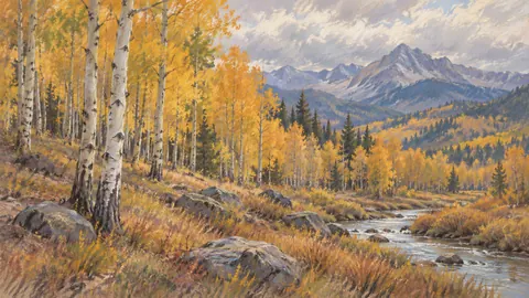
Soft pastel drawing

Soft pastel drawing
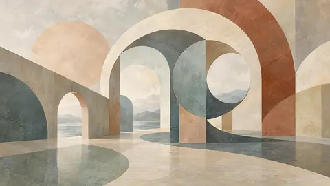
Muted pastel organic abstraction
Muted pastel organic abstraction
Muted pastel organic abstraction
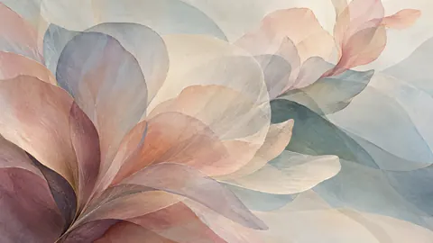
Muted pastel organic abstraction

Muted pastel organic abstraction
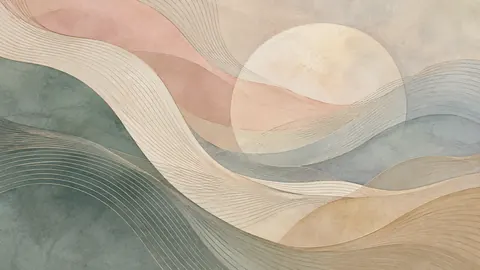
Muted pastel organic abstraction
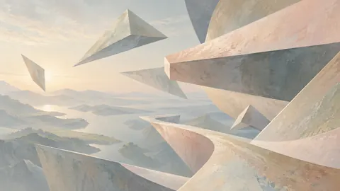
Muted pastel organic abstraction
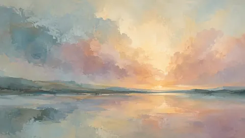
Muted pastel organic abstraction
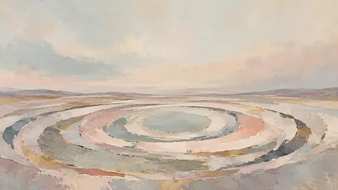
Muted pastel organic abstraction
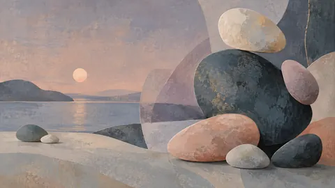
Muted pastel organic abstraction
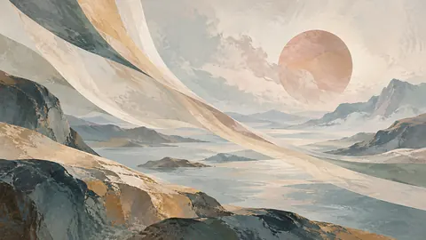
Muted pastel organic abstraction
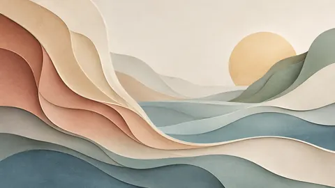
Muted pastel organic abstraction
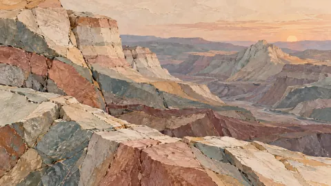
Muted pastel organic abstraction
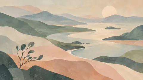
Muted pastel organic abstraction
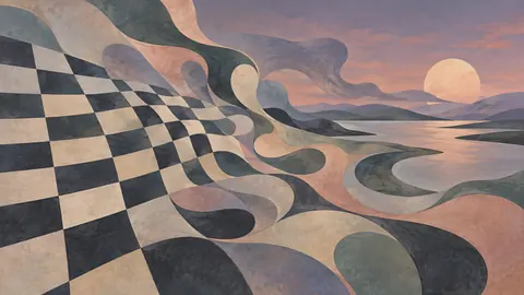
Muted pastel organic abstraction
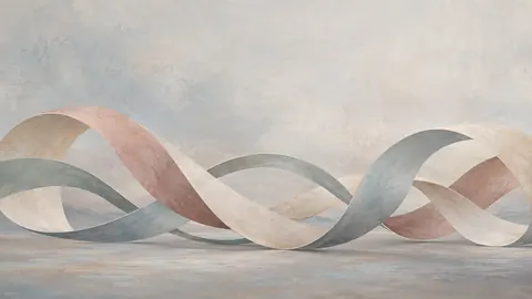
Muted pastel organic abstraction
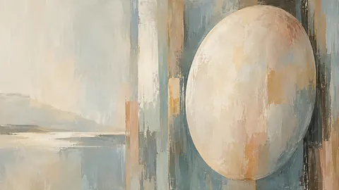
Muted pastel organic abstraction
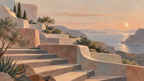
Muted pastel organic abstraction
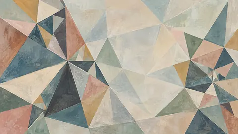
Muted pastel organic abstraction
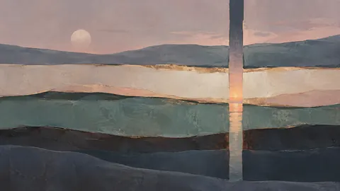
Muted pastel organic abstraction
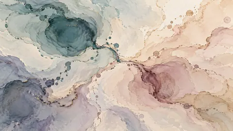
Muted pastel organic abstraction
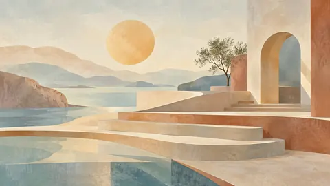
Muted pastel organic abstraction

Soft pastel drawing
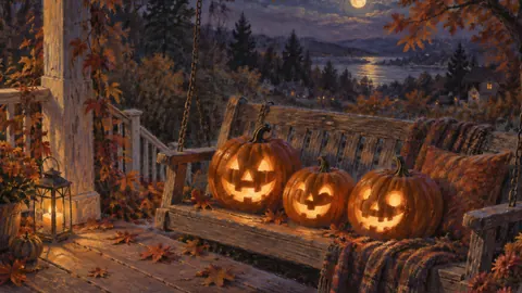
Soft pastel drawing
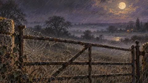
Chalk pastel study

Soft pastel drawing
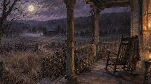
Soft pastel drawing
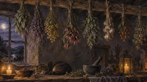
Chalk pastel study

Soft pastel drawing

Soft pastel drawing

Chalk pastel study
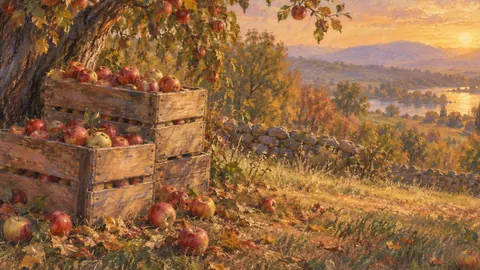
Soft pastel drawing

Chalk pastel study
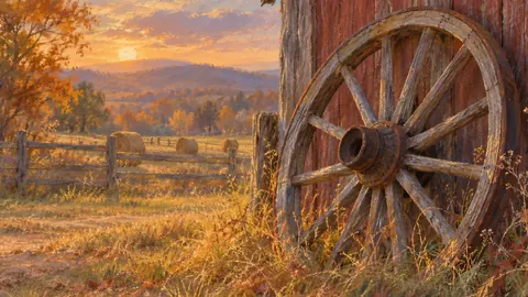
Soft pastel drawing

Chalk pastel study
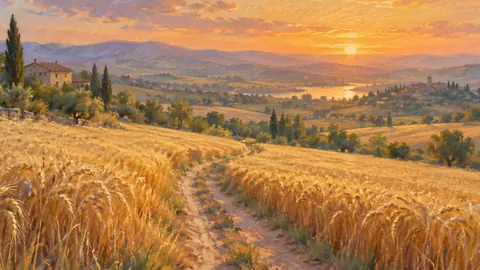
Soft pastel drawing

Chalk pastel study
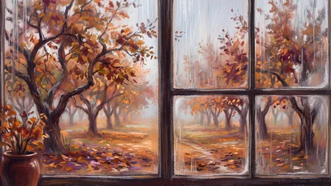
Chalk pastel study

Chalk pastel study

Soft pastel drawing

Chalk pastel study
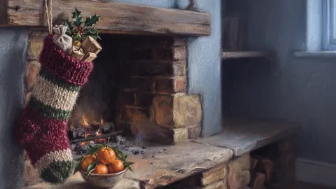
Soft pastel drawing

Chalk pastel study
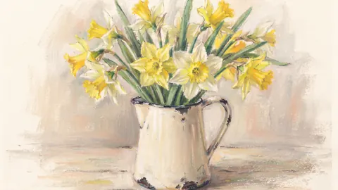
Soft pastel drawing
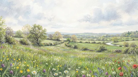
Chalk pastel study
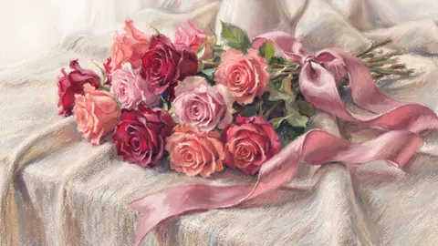
Soft pastel drawing
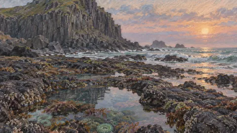
Soft pastel drawing
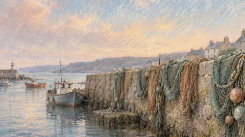
Muted pastel organic abstraction

Chalk pastel study
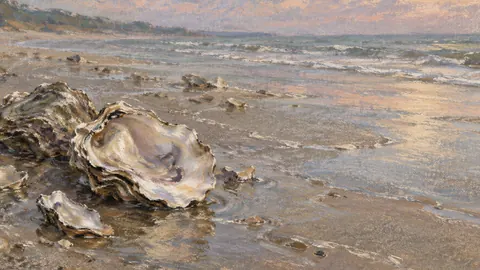
Chalk pastel study

Soft pastel drawing
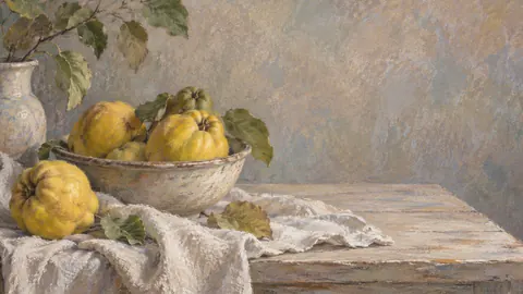
Soft pastel drawing
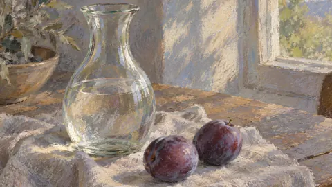
Chalk pastel study
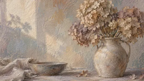
Muted pastel organic abstraction
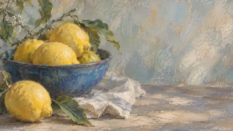
Soft pastel drawing
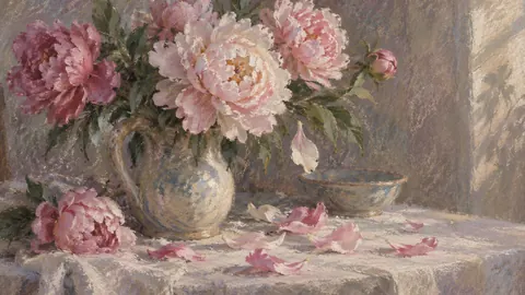
Chalk pastel study
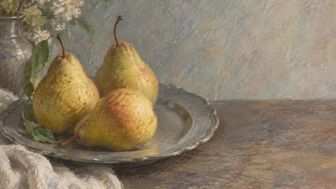
Soft pastel drawing
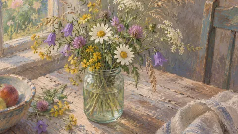
Chalk pastel study
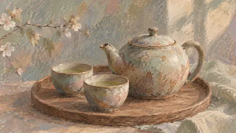
Muted pastel organic abstraction
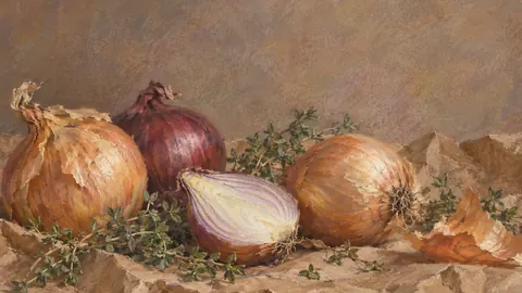
Soft pastel drawing
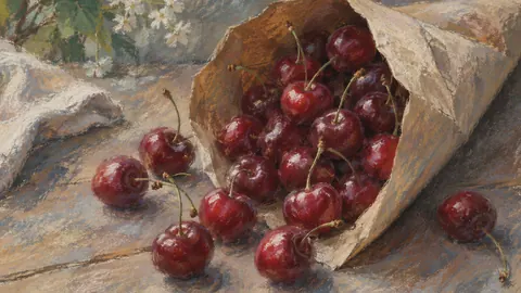
Chalk pastel study
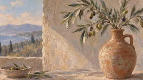
Soft pastel drawing
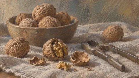
Chalk pastel study
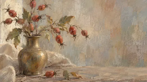
Muted pastel organic abstraction

Soft pastel drawing
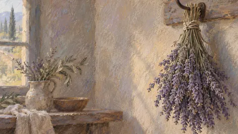
Chalk pastel study
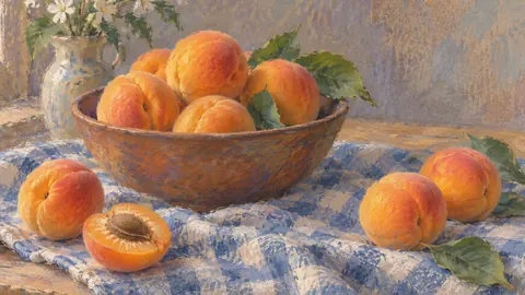
Soft pastel drawing
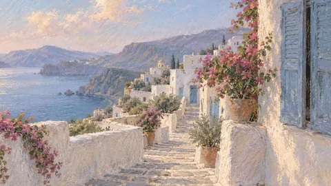
Soft pastel drawing
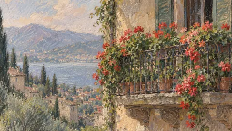
Chalk pastel study
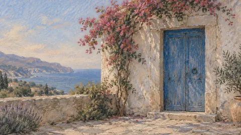
Soft pastel drawing
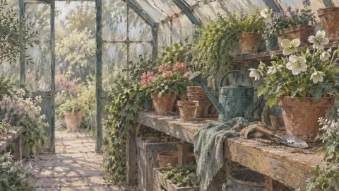
Chalk pastel study
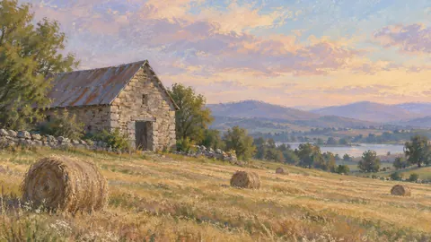
Soft pastel drawing
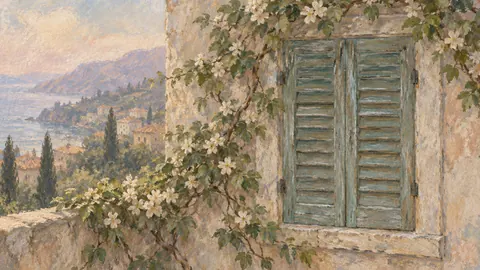
Muted pastel organic abstraction

Soft pastel drawing

Chalk pastel study

Muted pastel organic abstraction

Chalk pastel study
Every design on this site is included: 12 collections, 12 seasons and occasions, delivered as 3840 × 2160 JPEG (4K, 16:9, sRGB). One download, no subscription – yours to keep on Samsung The Frame or any 4K TV.
Other ways people look for pastel & soft Frame TV art:
They are meant to be soft, but they are not faint: each one is composed with a clear focal point and enough contrast to read from across the room. If it looks too pale, raise Art Mode brightness by one notch rather than changing colour tone.
Yes – a warm-white or wall-coloured matte suits them particularly well, because the muted palette and the paper grain read as a mounted drawing.